Categories: geek » design

RSS - Atom - Subscribe via email

Thinking about adaptive menus for tracking

Posted: - Modified: | design, development, geek, quantified, research

I’ve been thinking about building more tools for myself. Some of the ideas I’ve been playing around with are around simplifying activity tracking further, possibly getting it to the point where it suggests things for me to do when my brain is fuzzy.

My current tracking system has two tiers. For my most-common activities, I use a custom menu that I can open from my phone’s home screen. I created the menu using Tasker. It’s easy to configure menu items to update my Quantified Awesome activity records as well as run other logic on my phone. For example:

  • “Eat dinner” creates an activity record for “Dinner”, then starts MyFitnessPal so that I can log the meal
  • “Walk home” creates an activity record for “Walk – Other”, then starts step-by-step navigation of the walk back to my house
  • “Sleep” creates an activity record, then launches Sleep as Android
  • “Ni No Kuni” creates an activity record, prompts me for what I want to do after an hour of playing, opens a page with tips for the game, and then reminds me of my plans after that hour passes

One advantage of using something on my phone is that I don’t have to wait for the initial web page from Quantified Awesome to load. My keyboard occasionally takes a while to come up, too, so the menu-based interface gets around that as well. Also, as I get the hang of using Tasker, I can set up more intelligent processes. The menu has a link to open the web version, so if I want to track something less frequent, I can always use the web interface.

In the web interface, I usually type a substring to identify the category I want to track. For example, “kitch” results in an activity record for “Clean the kitchen”. I use this interface if I need to backdate entries (ex: -5m), too.

In addition to the two interfaces above, I’ve been thinking about taking advantage of the predictability of my schedule.

Research into adaptive menus turns up quite a few design ideas and considerations. Since I’m building this for myself, I can get around many of the challenges of adaptive interfaces, such as privacy and predictability. I’m curious about the following options:

  • Text-based input with minimal cues, as part of a more powerful command line
  • Context-sensitive menu with a handful of items (3-4, with a link to more): I can probably suggest candidate activities based on the past two activity records. That might mean a little bit of latency as I check, though. It also means that the menu will keep shifting, so I’ll need to read it and find the item I want to click on.
    • For everyday use?
    • For really fuzzy moments?
  • Static menu of frequent items, but adaptive highlighting (ex: green or bold, or fading out other things slightly)
    • Abrupt onset, others fading in over 500ms
    • Colour?
    • Weight?
  • Split menu: frequent items on top, everything else below
    • Static
    • Adaptive
  • Hierarchy of menus: speedy, but lots of tapping
  • Cut off menu: show only the activities that come after the one I’ve just tracked

Hmm… It might be interesting to play around with different menu options. It would be good to experiment with NFC as well, especially early in the morning. =)

Related:

Where am I in terms of design?

Posted: - Modified: | design

I'm working on learning more about design. I don't think about it all the time, but sometimes I check out design blogs like Little Big Details and CSS Tricks. I'm getting the hang of sketching several variants instead of jumping straight into the first idea I have, and sometimes I even show those wireframes to other people before coding it up.

Someone asked me where I'd rate myself on a scale of 1 to 10. It's hard to do that without thinking about what 1 and 10 are and what's in the middle. Besides, I know that the scale will keep shifting anyway. I'll never ever get to 10, and this is good. There's always more to learn.

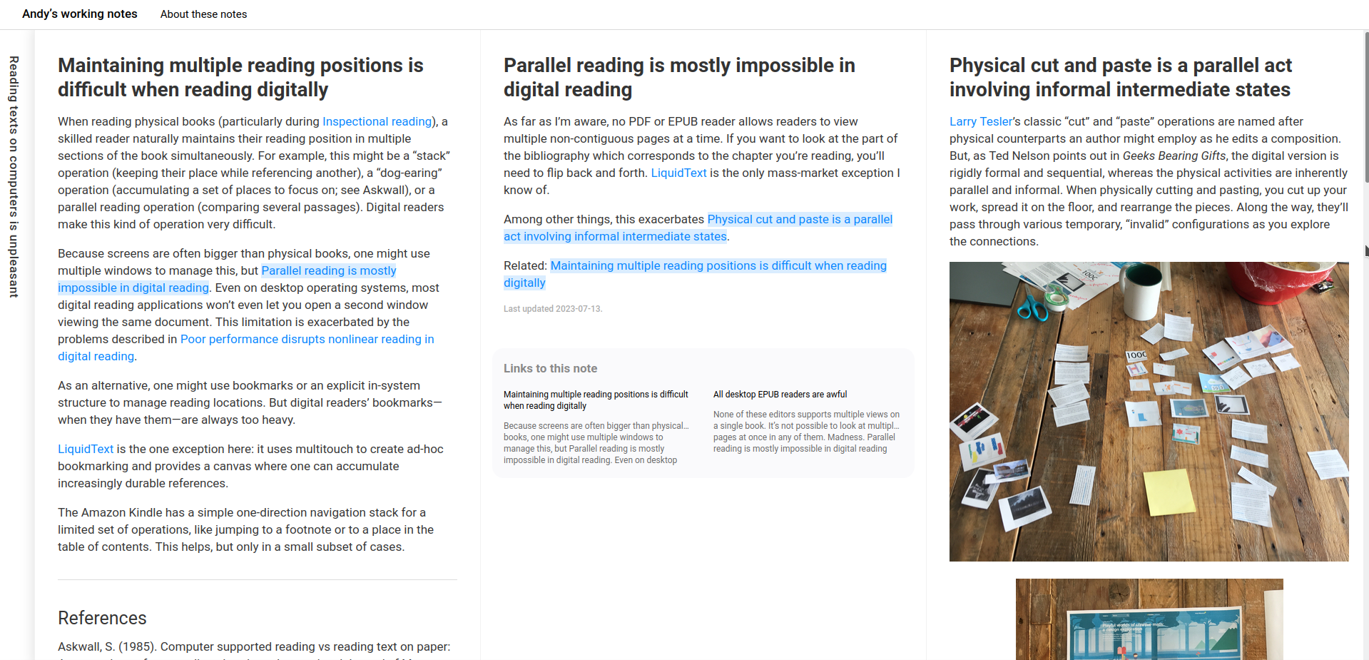
Anyway, here's what I came up with. Which, on reflection, might be overstating it. Sometimes I feel like I'm still throwing everything in including the kitchen sink. But at least this gives me a map, a You Are Here, and more usefully, a sense of what the next step on the path might be.

2014-11-29 Where am I in terms of design

There are at least three components to this, I think. TECHNICAL SKILLS–the CSS and Javascript, the code and the fiddly bits–that's actually the smallest part, and probably the easiest. I'm not too worried about that. I can learn it when I need to, following the tutorials that other people have written. For the few things that aren't covered by Javascript polyfills and StackOverflow answers, I can use trial-and-error to bodge my way through (at least until I understand things better).

DESIGN SENSE–now that's tough. I can read all the usability books I want. I can study the key principles of visual hierarchy or grouping. I can take a master's degree in human-computer interaction. (Wait, I did!) I know I'm supposed to keep the end users in mind, either by talking to people directly or by keeping personas in front of me. I know I'm supposed to keep things simple and discoverable, with affordances that encourage you to use things in the right way.

I can mostly find my way down well-worn roads. (Want a real-time status update visualization? A mosaic of news items on the front page? A multiple choice survey? Gotcha.) I am often asked to come up with something new, though. Sometimes it's just new to the group, so we figure out what people want after a little back-and-forth. Sometimes it's new to me, and I have to do some research. Sometimes, I suspect, I'm trying to come up with something a little new to everyone. Or at least it requires a lot more translation to find something familiar to draw on.

But there's still so much more to learn before I can confidently sift through conflicting feedback, before I can guide people from vague ideas to that flash of recognition: “Ah, yes, this is what I wanted.”

I don't know if it's just a matter of experience. I've worked with designers on web projects and I've disagreed with them. (Gradients? Really? And you want that to do what?) I've also worked with designers I got along really well with, especially the ones who weren't coming from a print background and who knew the difference between what looked flashy and what was easier to do on the Web.

So. Design sense. This is the part that intrigues me the most. I'm working on developing opinions. It's not just about memorizing a bunch of principles or applying the latest fads (from skeumorphic to flat, from static to parallax, etc.). I think it involves being able to see, understand, and recommend. Browsing through design blogs doesn't really help me with this. I have to slow down and think about why something works, why it doesn't, what other variants I might try, why I like something or another. And then, beyond opinion, there's also measurement: revealed preferences often go against what we think we want.

This is where WORKFLOW comes in. I've been working on resisting the temptation to jump in and start coding things right away. Instead, wireframing possible designs means I can play around with how something looks and behaves, changing it with less friction. (It also means I can turn ideas over to team members in case they want to use that for development practice.) Getting the hang of wireframing will also help me try different variations while being less invested in them.

Research can help me quickly find different types of the same idea, so I can broaden my horizons. For example, looking at a few support communities (Adobe, Apple, and Skype) gave me a better sense of what I liked about each of them and why.

My main challenges for design and workflow are:

  • How can I apply what I'm learning within the constraints that I have? For example, it's one thing to know that testing is good. It's another to think about how I might do A/B testing without proper analytics and without hundreds of thousands of views.
  • In the absence of stronger metrics, how can I work with conflicting feedback? Can I get better at generating different variants to help people find something they agree on? Can I get faster at working with low-fidelity prototypes or in-browser code?
  • How can I recognize familiar aspects in new ideas, and get better at cobbling together well-tested ideas from different places? Hmm. Come to think of it, it's a little like those Master Builders in the LEGO Movie, isn't it? There's something about that ability to look at something and say, “Oh, that looks unfamiliar, but it's really like A and B and C.” I do this kind of connecting-the-dots outside design. I can learn how to do it here too. (Analogies are another way to practise this. =) )

I'll probably be able to get the hang of the tech along the way, so I'm not worried about it.

I think this will help me learn the kind of design I want. I'm not really interested in the kind of design that involves following fairly well-sorted out paths making snazzy websites for other people, like WordPress theme customization or development or things like that. I can pick that up if I need to, probably.

I'm more curious about getting better at designing new(ish) things, the kind where I can't just pick a few sites for design inspiration, the kind where I'm making something I haven't seen before and I have to decide what to show and how it behaves.

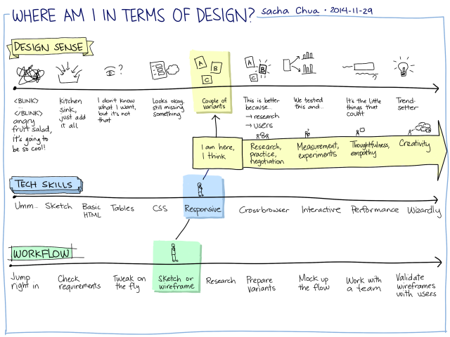
Oh! Here is another version of that sketch, in case you want to fill it in yourself. =)

2014-11-29 Where am I in terms of design - blank

Programming and creativity

Posted: - Modified: | design, development

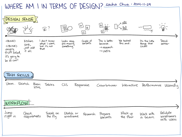
My client had been bringing me a constant stream of little technical challenges to solve. I pulled together different tools to make things happen: AutoHotkey, NodeJS, shared files, optical mark recognition, and so on. He said it was fun watching me figuring things out. It got me thinking about how programming can involve many different types of creativity. If you can tell the different types apart, you might be able to focus on improving some of those aspects.

2014-09-10 Programming - What does it mean to be creative?

2014-09-10 Programming – What does it mean to be creative?

Here's a rough first pass:

  • Design: Probably the most obvious form of creativity in development, whether we're talking about interfaces or architecture.
  • Imagining or anticipating needs: When people don't even know what they're missing
  • Imagining practical applications: Starting from the solution or from an available tool
  • Seeing gaps and being curious about possibilities: Maybe related to anticipating needs? More like, “Hmm, what if?”
  • Collecting components/capabilities and combining them: API functions, tools, etc. Like collecting puzzle pieces and then being able to dig up the right combination later on.
  • Making adapters: Smooshing different systems together.
  • Generating variants and other ideas: Coming up with different approaches, or coming up with variations on a theme.
  • Incorporating feedback and iterating effectively: Probably related to generating variants or shaping requirements, but also related to getting beyond vague requirements or too-concrete requirements.
  • Breaking things down and building a plan: Seeing the components and figuring out a good order.
  • Shaping requirements: Translating vague requirements/feedback or seeing past what people think they want.

Hmm…

Designing Help and Support: Skype

Posted: - Modified: | design

I've looked at Adobe and Apple, both of whom run their support communities on Jive. Here's a look at Skype.

2014-07-02 14_35_54-English - Skype Community

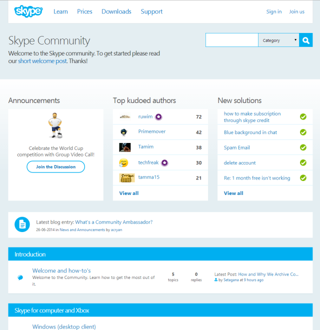
Skype uses a typical forum layout (categories, forums, # of topics, # of replies, latest post) with extra widgets to highlight announcements, contributors, solutions, and blog posts.

2014-07-02 14_39_50-Windows (desktop client) - Skype Community

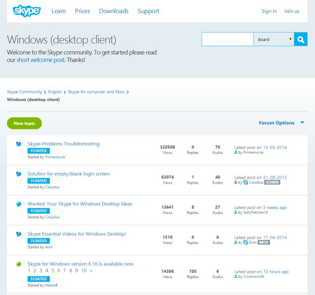
Forum pages list threads, number of views,  replies, and kudos. Sticky threads are labeled as “floated”. As with Apple, I'd probably link to relevant knowledgebase categories from here, to save people the navigation and to encourage them to explore.

2014-07-02 14_40_58-Welcome to the Skype Community - Skype Community


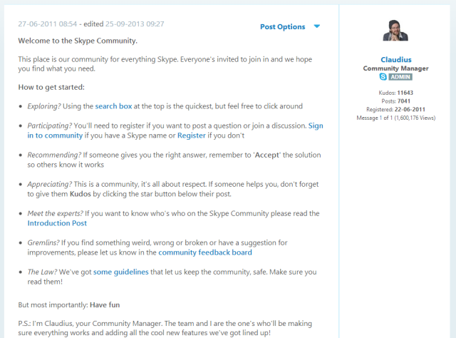
The forums include a link to this welcome post. It includes brief instructions and quick links.

2014-07-02 14_42_55-News and Announcements - Skype Community

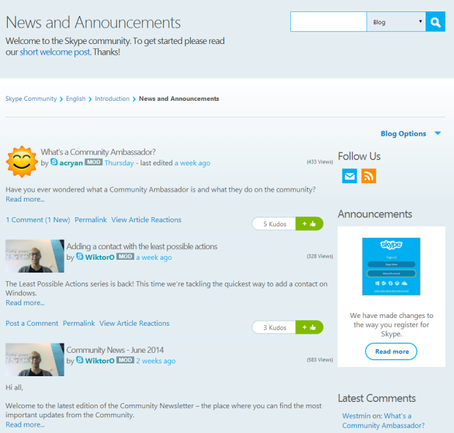
The News and Announcements section is a list of blog posts with excerpts. The light blue line that separates each post practically disappears into the page background. I would probably make the author photos consistent-width, post titles more prominent (probably darker, larger, and flush left with the margin) so that they're easier to scan, include a slightly longer excerpt, and maybe make the kudos icon less prominent. The bright green makes the kudos icon the most salient thing on the page.

By golly, I'm actually starting to develop opinions! =)

Learning to design Help and Support communities: Apple deep dive

Posted: - Modified: | design

I'm looking at how people design help/Q&A communities to support a wide range of users. After looking at Adobe's examples, I'd like to focus on another company well-known for design savvy: Apple.

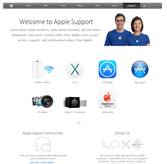
2014-07-02 14_10_47-Official Apple SupportApple uses a two-screen automatically advancing carousel on its front page. I find that curious because the carousel doesn't pause when you hover over it, although I guess that with only two slides, you can always wait until the icon you want slides back into place. If Apple did that in order to keep the Apple Support Communities and Contact Us links above the fold, I wonder why they didn't move those links up higher and then keep a static list of icons underneath it instead. Anyway…

2014-07-02 14_15_15-Welcome _ Apple Support Communities

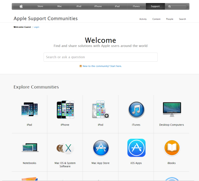
The main overview page has a big, simple Ask a Question widget that dynamically searches as you type. Underneath it, there are icons to the featured communities.

2014-07-02 14_16_48-Welcome _ Apple Support Communities

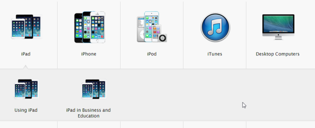
Clicking on an icon shows icons for subcommunities.

2014-07-02 14_17_21-Community_ Using iPad _ Apple Support Communities

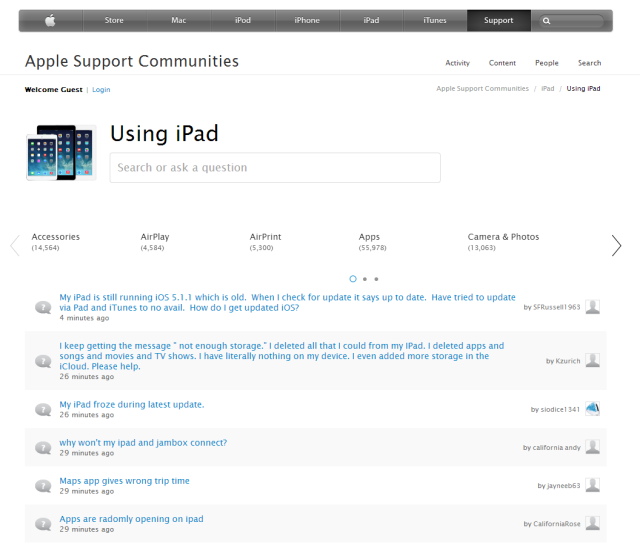
All the communities I've checked out seem to follow these lines. Big group icon, group title, ask a question box right underneath the group title. There's a manual slider with a custom category filter that loads the discussion list using AJAX, avoiding a page refresh.

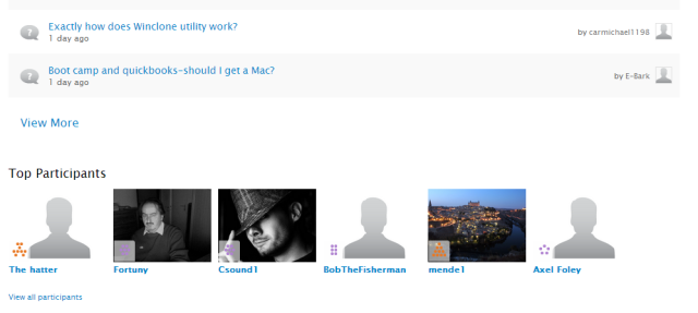
2014-07-02 14_20_04-Community_ Boot Camp _ Apple Support Communities

Some of the communities have a Top Participants widget along the bottom.

The Apple communities focus exclusively on Q&A – they don't link to tutorials or other resources to help people get better at using things. IF you click on the Content link, you can find tips, but they're hidden and tend to fall off the recent content list. The Content link lists content for all the communities, not the particular community you're interested in – the Apple discussions theme doesn't include a link to the content for your particular community.

The discussion-focused approach is interesting, but probably a little too severe. Providing links to tutorials and frequently asked questions can help people who are getting started and don't know what they don't know. This information is available elsewhere (ex: http://www.apple.com/support/mac/), so that could explain why it's not duplicated in the support site. Anyway, Apple's support communities are clean and stripped down to the essentials.


Learning from things I like: Smashing Magazine's responsiveness

Posted: - Modified: | design

I'm teaching myself design by looking at things I like and trying to figure out why I like them. Smashing Magazine is not only a good blog for design inspiration, but it's also (naturally!) a great example of techniques.

One of the things I like about Smashing Magazine is how the site adapts to different screen sizes. For example, if you view it on a mobile device or in a small window, you'll see a simple header and the story.

2014-07-07 12_45_42-Smashing Magazine — For Professional Web Designers and Developers

The menu icon links to the footer menu, which is used only with narrow screens:

2014-07-07 13_08_53-Coding Archives _ Smashing Magazine

If you have a little more space, the header will include the top-leel site sections (books, e-books, workshops, job board) and the left sidebar will include categories. The search also moves from being hidden behind an icon to having its own space.

2014-07-07 12_45_26-Smashing Magazine — For Professional Web Designers and Developers

Even more space? The left sidebar gets collapsed into a small horizontal menu, and a right sidebar appears with an e-mail subscription form and some highlights from other sections. I wonder why the left sidebar is collapsed into the menu, but I guess it would be weird to have the category list jump from the left sidebar to the right sidebar and then back again, and they probably wanted the e-mail subscription form to be above the fold (so it wouldn't make sense to add it to the left sidebar). The search box is moved to the top of the right sidebar, too, so it looks more like a background element.

2014-07-07 12_45_09-Smashing Magazine — For Professional Web Designers and Developers

Incidentally, here's a little thing that happens when the window is just a little bit narrower – the WordPress menu item gets abbreviated to WP.

2014-07-07 13_05_24-Coding Archives _ Smashing Magazine


And here's what the site looks like when I maximize the window. There's the header, the left sidebar, and the right sidebar.

2014-07-07 12_44_45-

I also like Smashing Magazine's use of colours – the cool blue matches well with the warm red, for some reason that I can't quite explain at the moment. I also like how they use different grays to make things recede into the background.

When I redesigned my site, I wanted to do something like the responsiveness of Smashing Magazine, so I learned more about using media queries. Here's how my site behaves at different sizes. (Or at least, how it should!) On a small screen, the key links are just hand-drawn icons, and there's no sidebar:

2014-07-07 12_50_57-sacha chua __ living an awesome life - learn - share - scale

Slightly wider? I can add some text to the links, and I can add a couple of optional links like Random.

2014-07-07 12_51_17-sacha chua __ living an awesome life - learn - share - scale

On a normal-sized screen, I add a sidebar on the right side.

2014-07-07 12_51_32-

On a wide screen, I move the post meta information to the left margin.

2014-07-07 12_51_54-sacha chua __ living an awesome life - learn - share - scale

Learning to design Help and Support communities: Adobe deep dive

| design

Design seems like magic, but it's probably a skill that I can develop. If I just focus on coding, the things I build can end up looking like an accumulation of little ideas designed by committee. If I learn more about design and develop my own opinions, I can make recommendations that simplify the experience and make it more coherent. For example, on one of my consulting engagements, I could probably take the initiative in redesigning the help and support community for a better user experience. I have to work with the technical limitations of the platform, but as a coder, I have a little more latitude than most people do. By looking at how other people have structured their support experiences, maybe I can pick up ideas that I can try.

It's interesting to see how much variety there is even within one company. Adobe uses the Jive platform for its support communities, and the different products have slightly different configurations. Here's the overall product page that leads to the community page:

Adobe

Adobe

http://helpx.adobe.com/photoshop.html

Adobe starts with graphical icons for tutorials that have time estimates clearly indicated.

2014-07-02 13_37_08-Community_ Photoshop General Discussion _ Adobe Community

https://forums.adobe.com/community/photoshop

The “Ask the Community” page leads to a page with a lot of things going on, but there's an “Ask a Question” widget in the top left with a quick way for people to ask questions. With the emphasis on points and the leaderboard of top participants, it seems that this community focuses on user-to-user support. That's probably why the Unanswered Questions and Trending Questions widgets are so prominent. Still, the page feels a little cluttered to me. I'd probably prefer to set it up with fewer calls to action. Ask a Question would still be in the top left, but I would probably organize the resources by skill level. I like the way some of the frequently asked questions are highlighted, but they feel somewhat random and not well-formatted.

Different products have different community pages. The Illustrator one is slightly more neatly organized:

2014-07-02 13_43_51-Community_ Illustrator _ Adobe Community

https://forums.adobe.com/community/illustrator

I like the announcement box for Illustrator CC 2014 and the Getting Started box in a prominent place. This page feels more oriented towards new users. It still has trending and unanswered questions, but they're below the fold.

2014-07-02 13_46_28-Community_ Premiere Pro _ Adobe Community

https://forums.adobe.com/community/premiere

The Premier Pro community focuses on sub-forums. Based on the forum activity, it looks like the Forums widget does a decent job of directing people to the appropriate place to ask, although the main community still gets many questions. This community is less newbie-focused (no tutorial link). The Recent Discussions widget seems to be a better choice than having both Unanswered Questions and Trending Questions, since the other widgets are visually similar and often have duplicate content.

2014-07-02 13_50_10-Community_ After Effects _ Adobe Community

https://forums.adobe.com/community/aftereffects_general_discussion

The After Effects community has a welcome message and a Getting Started box, which I think are good ideas. They've decided to highlight some discussions as Sticky Threads, too. Unlike the other communities, this community doesn't include messages about translating pages or earning points. I wonder how de-emphasizing points affects user-to-user support…

2014-07-02 13_54_57-Community_ Lightroom for Beginners _ Adobe Community

https://forums.adobe.com/community/lightroom/lightroom_for_beginners

The Lightroom for Beginners community uses graphics (that responsively resize, even!) to make frequently-asked questions more visually interesting.

2014-07-02 13_57_21-Community_ Acrobat _ Adobe Community

https://forums.adobe.com/community/acrobat

The Acrobat community directs people to the appropriate sub-forum.

2014-07-02 13_59_54-Welcome _ Adobe Community

https://forums.adobe.com/welcome

The overall welcome page for the site is static and graphical.

I think the key points I'll pick up from Adobe's support communities are:

  • A Welcome box makes a support community less intimidating.
  • Although having separate widgets for unanswered questions or trending content makes it easier for community managers and volunteers to find questions to respond to, that can lead to visual clutter. Recent discussions or recent content will do the job well enough.
  • Consistent formatting helps resource lists look more professional. Some of the resource lists had different font sizes or bullet types within the same box.
  • Images go a long way towards making a site look more polished.

Know any well-designed community support sites that offer both tutorials and Q&A? I'd love to take a closer look at them! Up next: Probably Apple, who use Jive as well.